Diverse and cultural inspiration collected along a five-month-long journey through South Africa and Europe.

This colorful large-scale mural is located on the outside of an industrial warehouse space hosting lively gatherings of pop-up restaurants and bars in the small coastal town of Saint-Jean-De-Luz. The charmingly imperfect organic illustrations and beautiful color palette both draw in and welcome locals and tourists alike. I have so much respect for the creatives who designed this hand-painted mural because it leaves behind the common trend of millennial minimalism and makes a significant shift towards a friendlier design style and color palette the reflects the town so well.
Saint-Jean-De-Luz, France
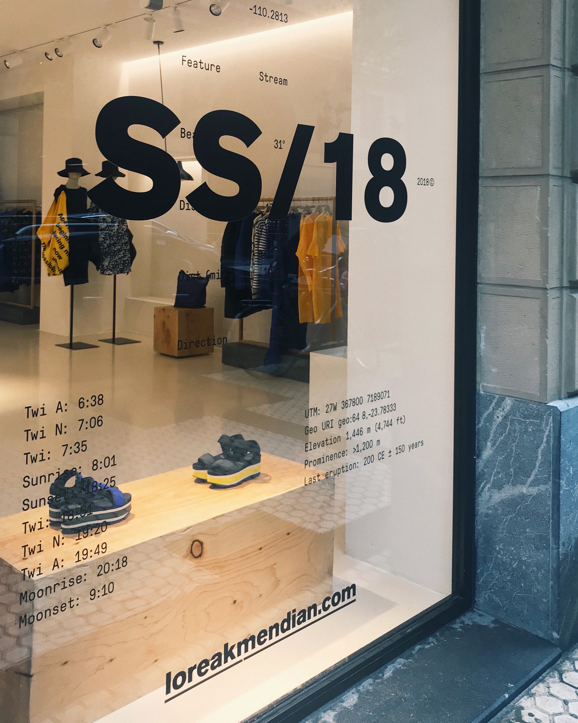
I'm particularity drawn to this type driven storefront because of the seamless and unpredictable typeface combination between the hierarchy of the contemporary san serif font and the secondary vintage typewriter font. Together these fonts create an aesthetically pleasing and clean grid system, mirroring the pioneering fashion scene of San Sebastian. The use of one color, black, doesn’t distract from the bold and minimal use of strictly bright blue and yellow inside the store.
San Sebastian, Spain
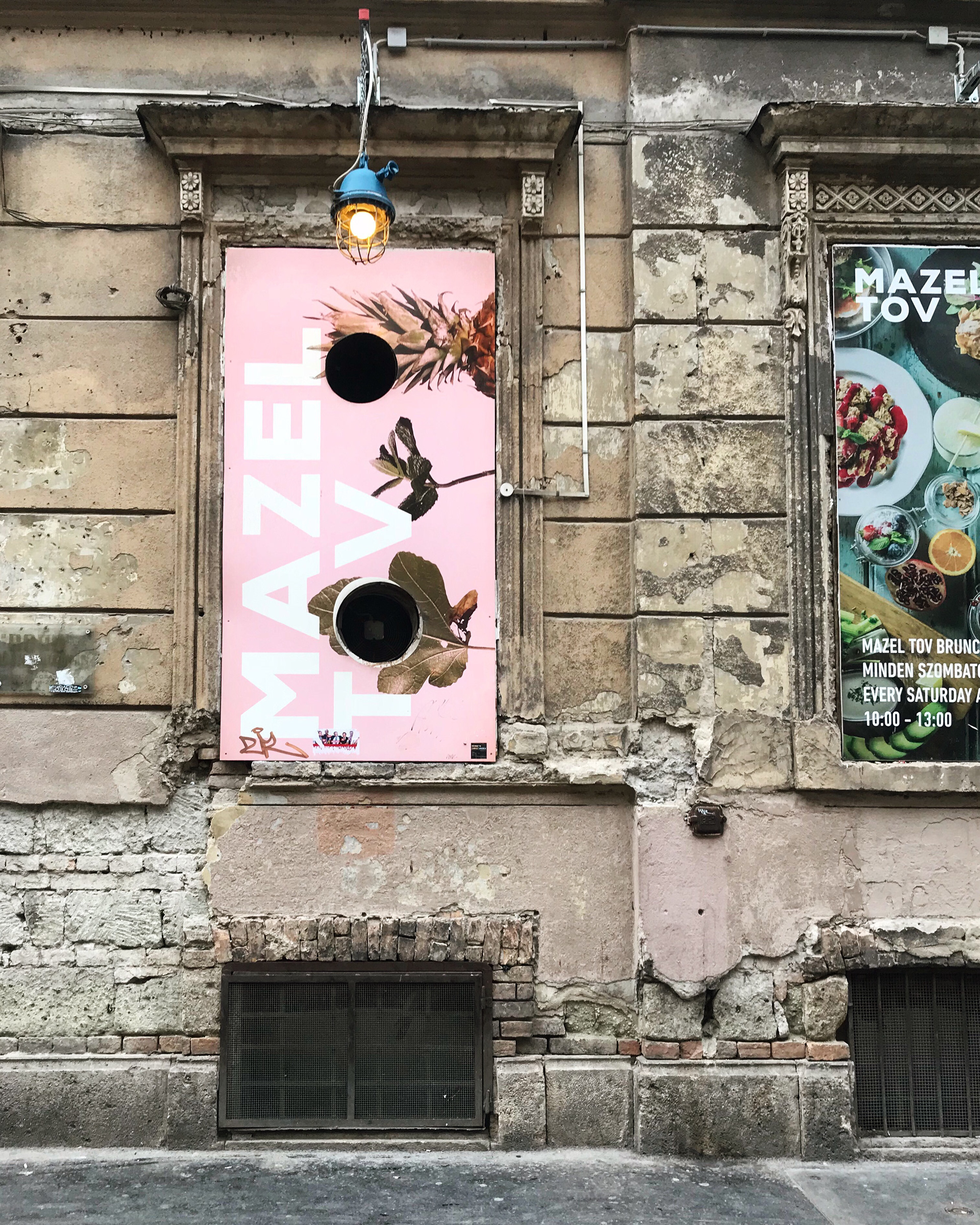
I am particularly enticed by these advertisements due to the juxtaposition between the contemporary design vs. the aged architectural context, creating an attention-grabbing effect. The playful branding and pink and blue overlay create an approachable energy, which is appropriate for the audience in a city full of life such as Budapest.
Budapest, Hungary
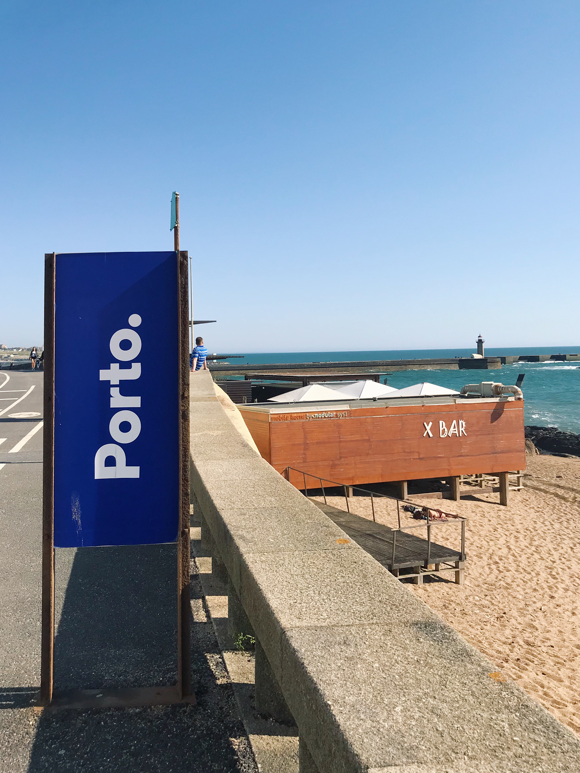
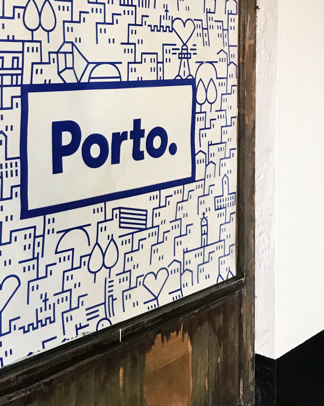
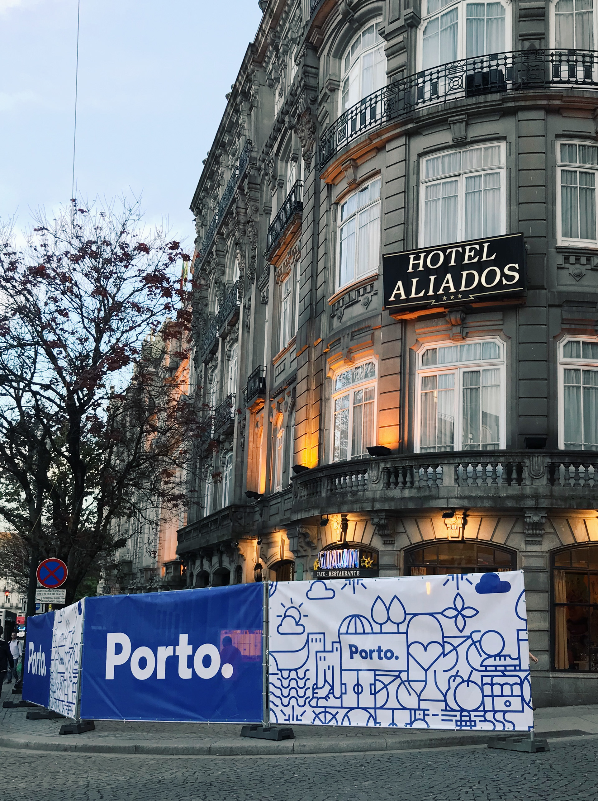

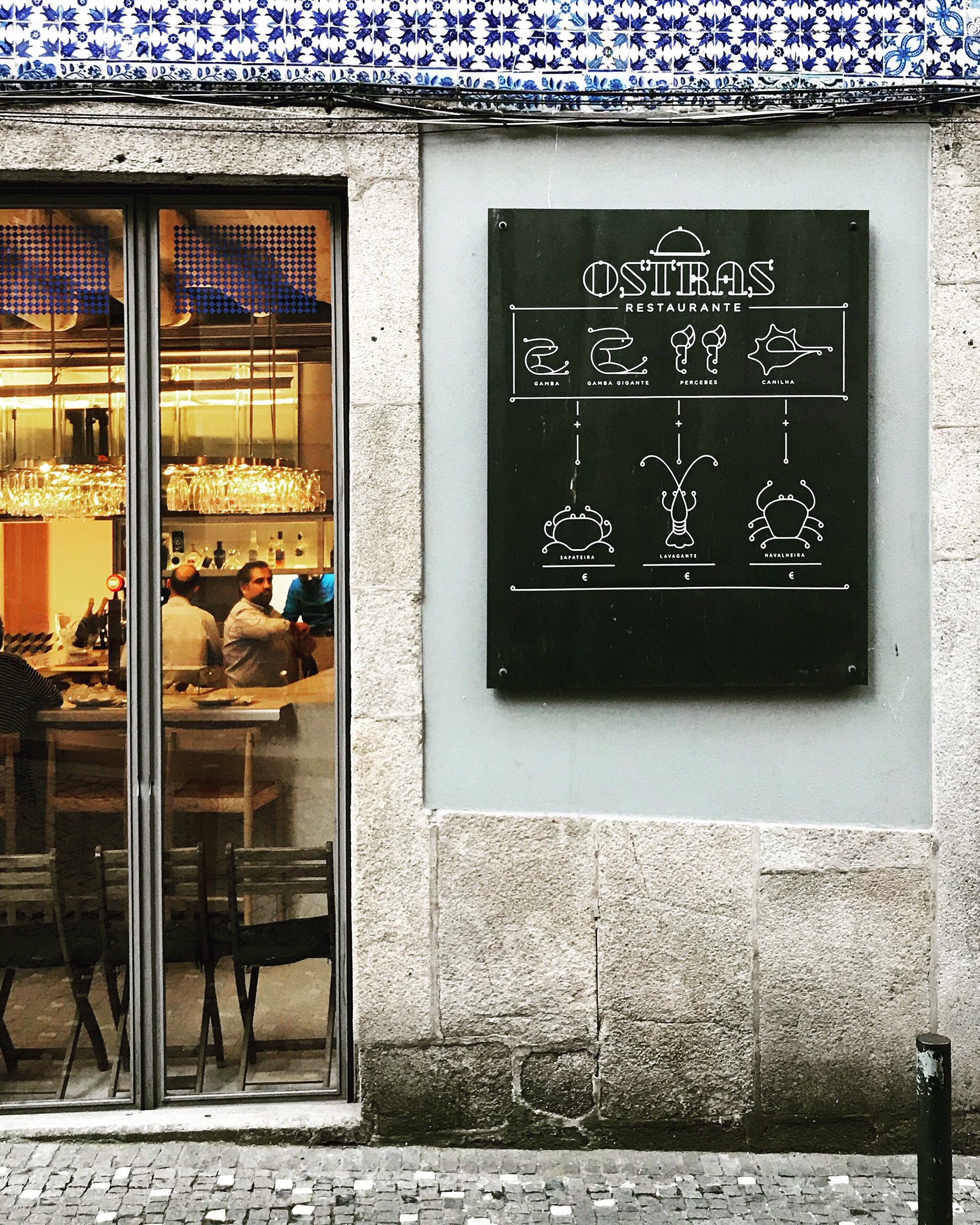
Porto’s eye-catching visual identity is a quintessential depiction of the city’s dynamic, vivacious and welcoming personality. The icons represented in Porto’s branding system establish the city’s rich and amiable culture. Porto has bridged the gap between the seemingly impossible of using multiple icons to represent an identity breaking the norm of just one. As a result, Porto maintains a common communication with both citizens and visitors alike. No one can argue that Porto’s branding has achieved the perfect unified representation of the global city of Porto.
Porto, Portugal
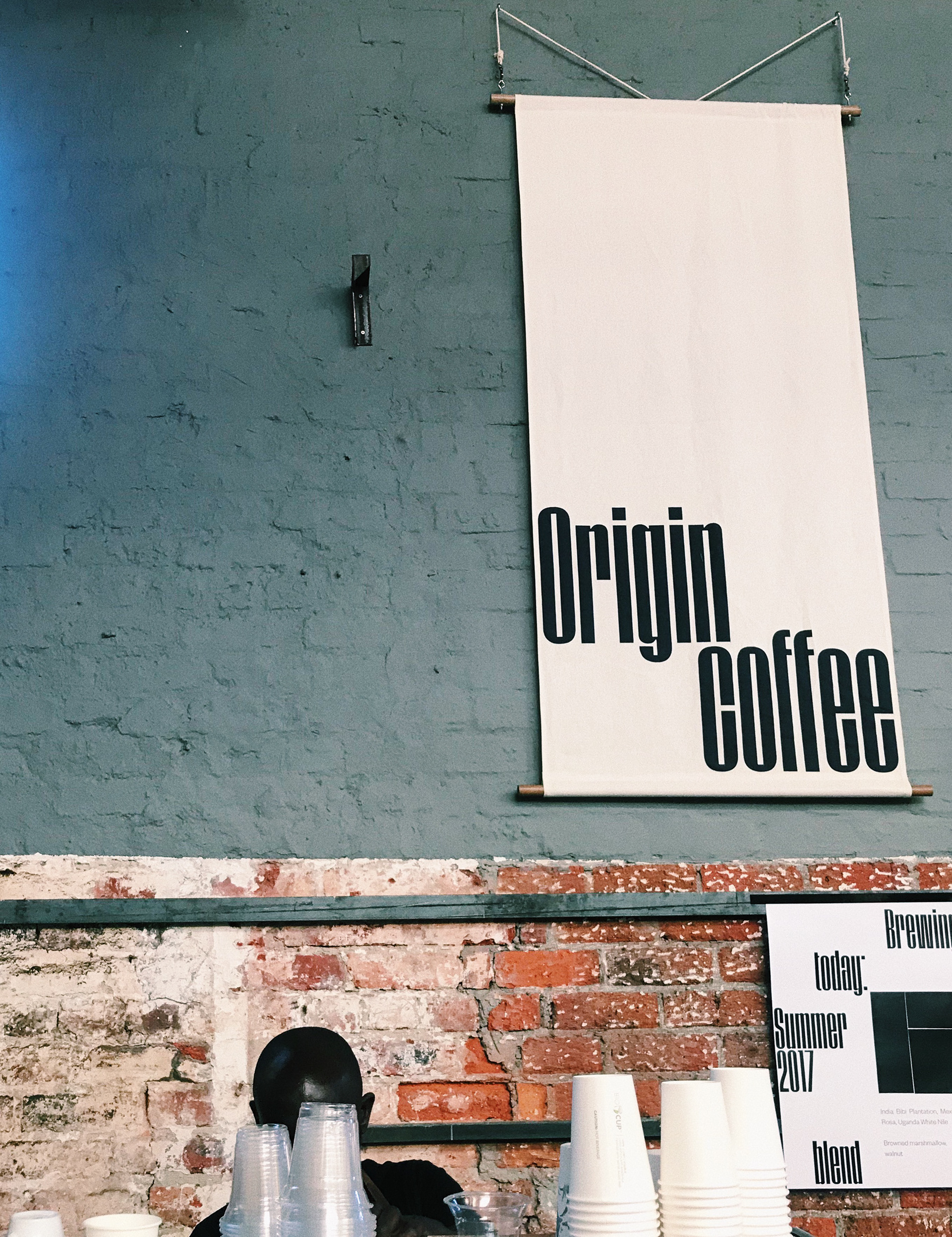
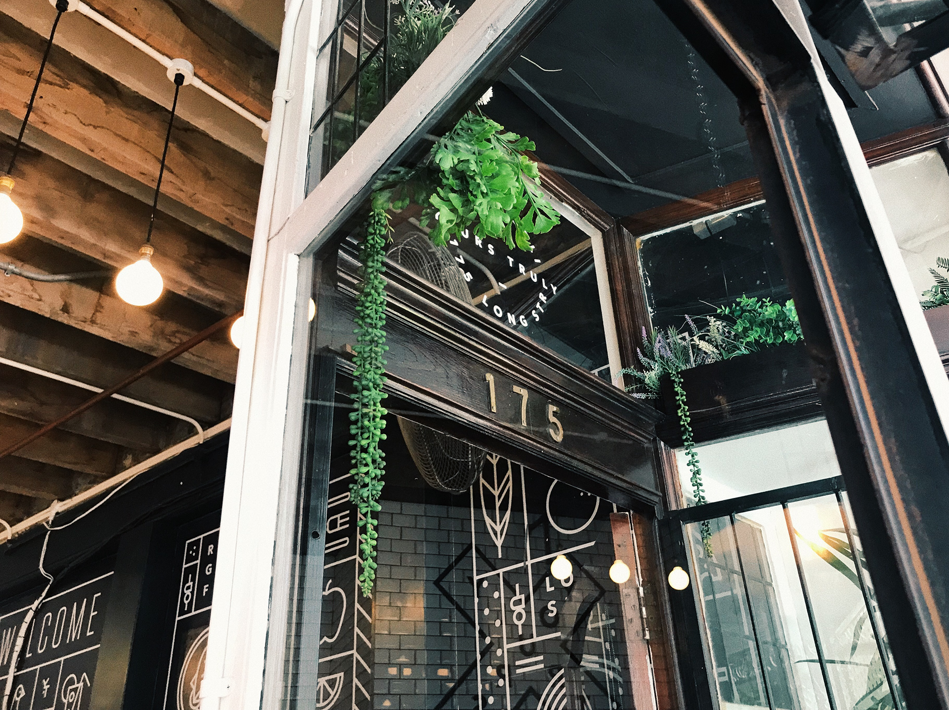
The Origin coffee banner is stunning in many ways. First, the elongated type paired with the elongated banner makes for both a beautiful and balanced combination and a custom-made look and feel. Secondly, the use of white space speaks louder than words. Next, the exact alignment of “n” in origin and the “c” in coffee meet together in middle for an extra dose of symmetry. Lastly, the poster below is flawlessly united in a consistent branding system.
Cape Town, South Africa
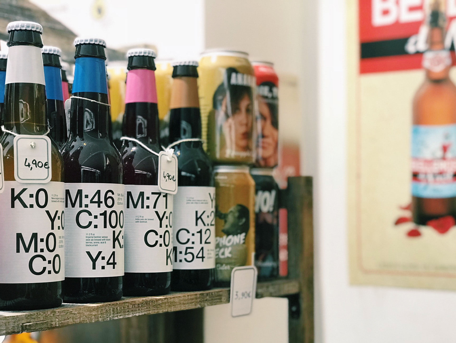
This ingeniously creative beer label design immediately caught my eye amongst an exorbitant amount of beers because 4-color process printing lies close to my heart. This beer package design mirrors the experimental style of the beer found at the brewery, Øl. With captivating colors corresponding to the flavor, and a mysterious cryptic code of letters and numbers, it evokes a curious and abstract experience.
Aix-En-Provence, France
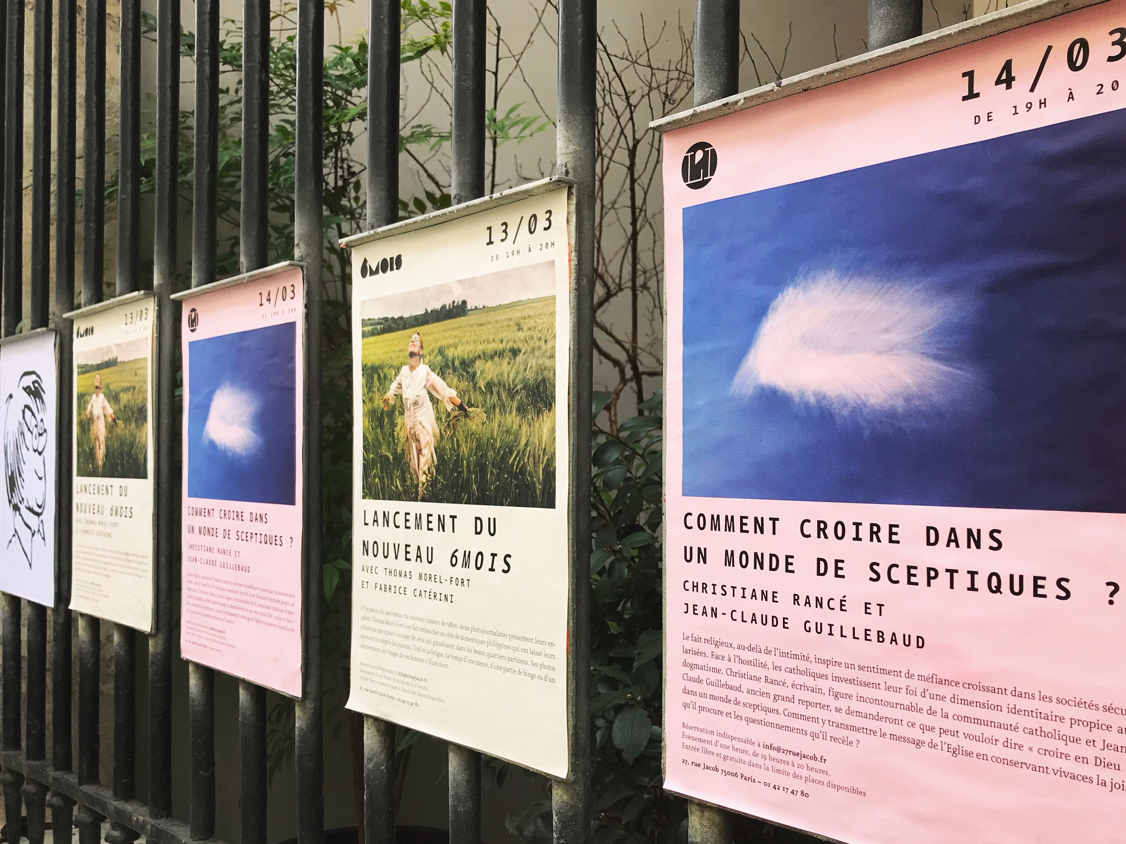
It’s no easy feat to steal my attention from the amazing streets of Paris, but these whimsical posters pulled off the perfect crime. The typeface is quirky, yet sharp and sophisticated at the same time. Both the tracking and leading have been well thought out, as well as a clear hierarchy, which all play an integral role in poster design. The unexpected illustration and the harmony of repetition of the posters establish an aesthetic with a playful edge. For someone who doesn't speak French, I was still able to get a feel for what the posters are communicating.
Paris, France

Kudos to the creative mind who made a mundane thing unexpectedly tasteful. This daring and simple gesture goes a long way, all while effortlessly complimenting the dark gray floors. Interesting to note that millennial pink is all the rage in a country outside the United States as well. Oh, how I’d love to see more of this in other ordinarily day-to-day places in an effort to beautify and better our surroundings.
Porto, Portugal
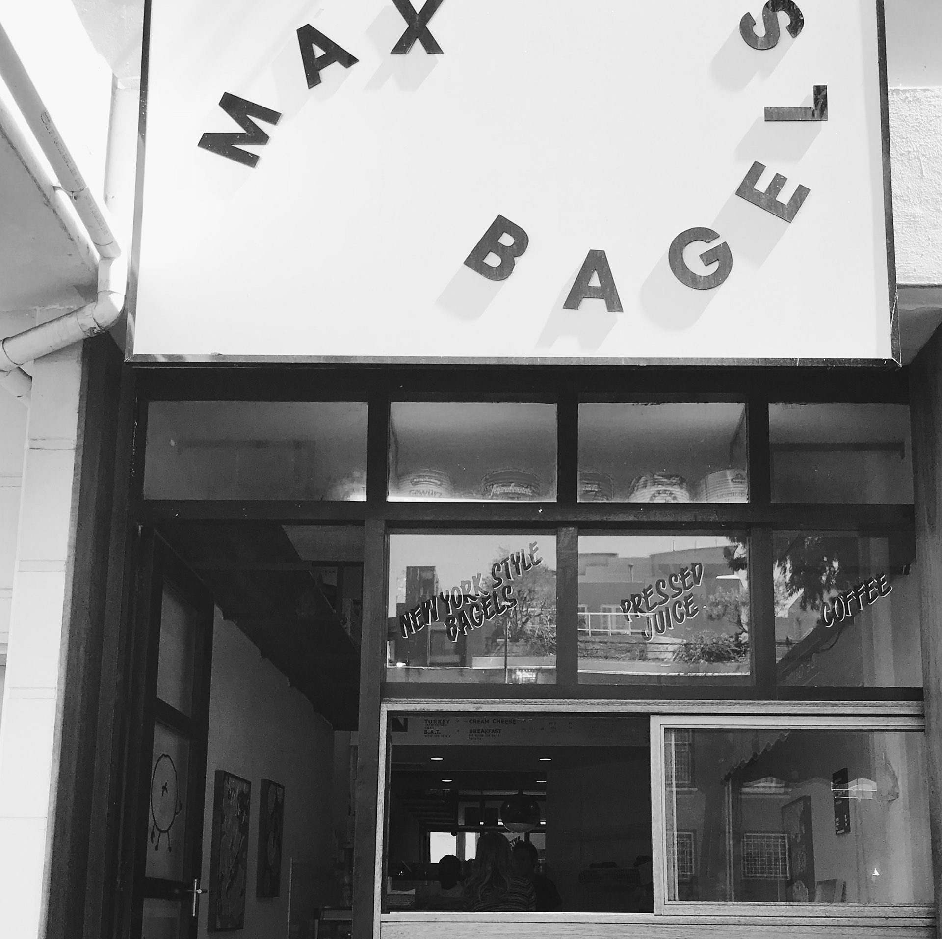

I couldn’t help but stop and take a photograph of this familiar looking New York style bagel shop in the middle of Cape Town. The first thing I noticed was the use of two popular movements trending in America; that being the use of minimalistic type and vintage typography. I was drawn to the contrast between the sharp edges of the san serif font paired with the organic feeling of the type placement, creating a sense of movement. The shadow of the typography on the signage generates a simple and effortless 3-D effect that yields interest in the minimal type and the white background.
Cape Town, South Africa


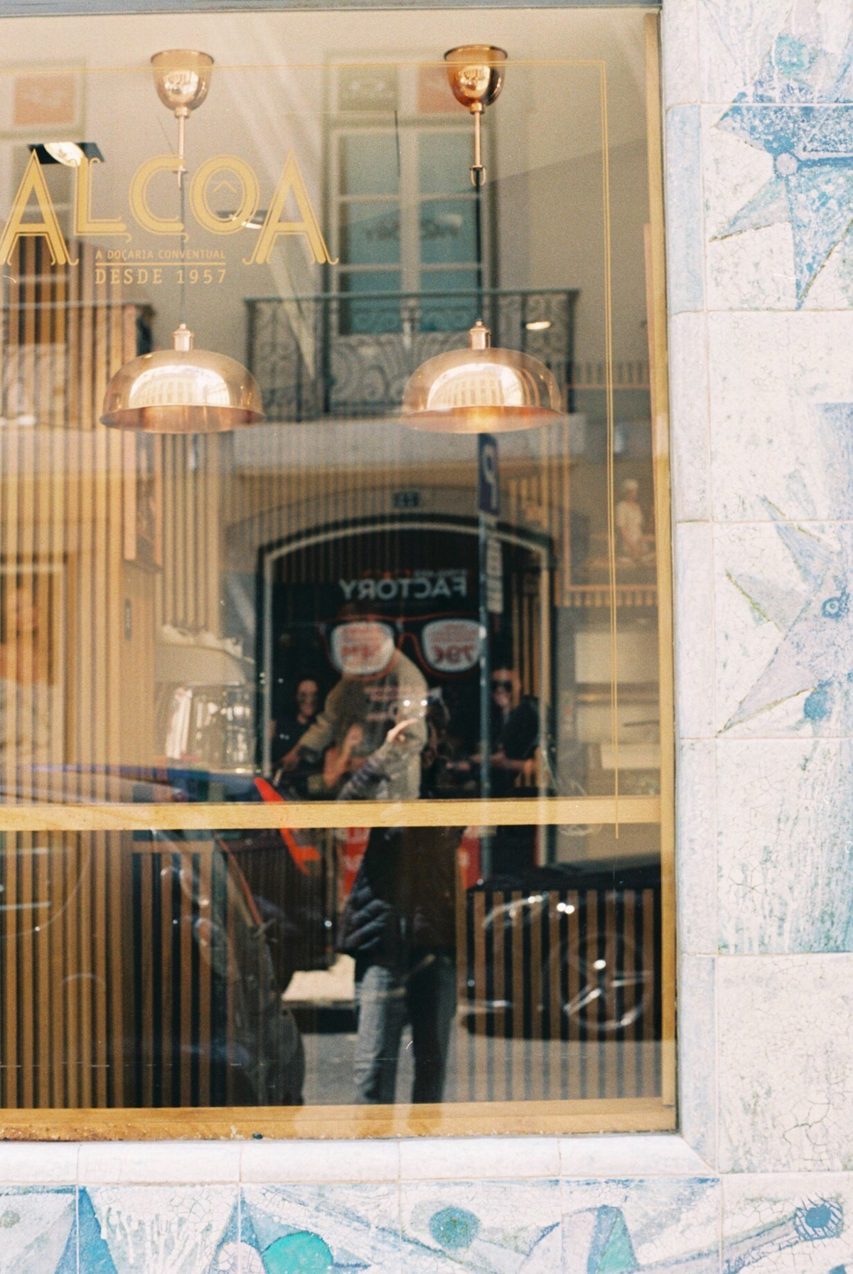
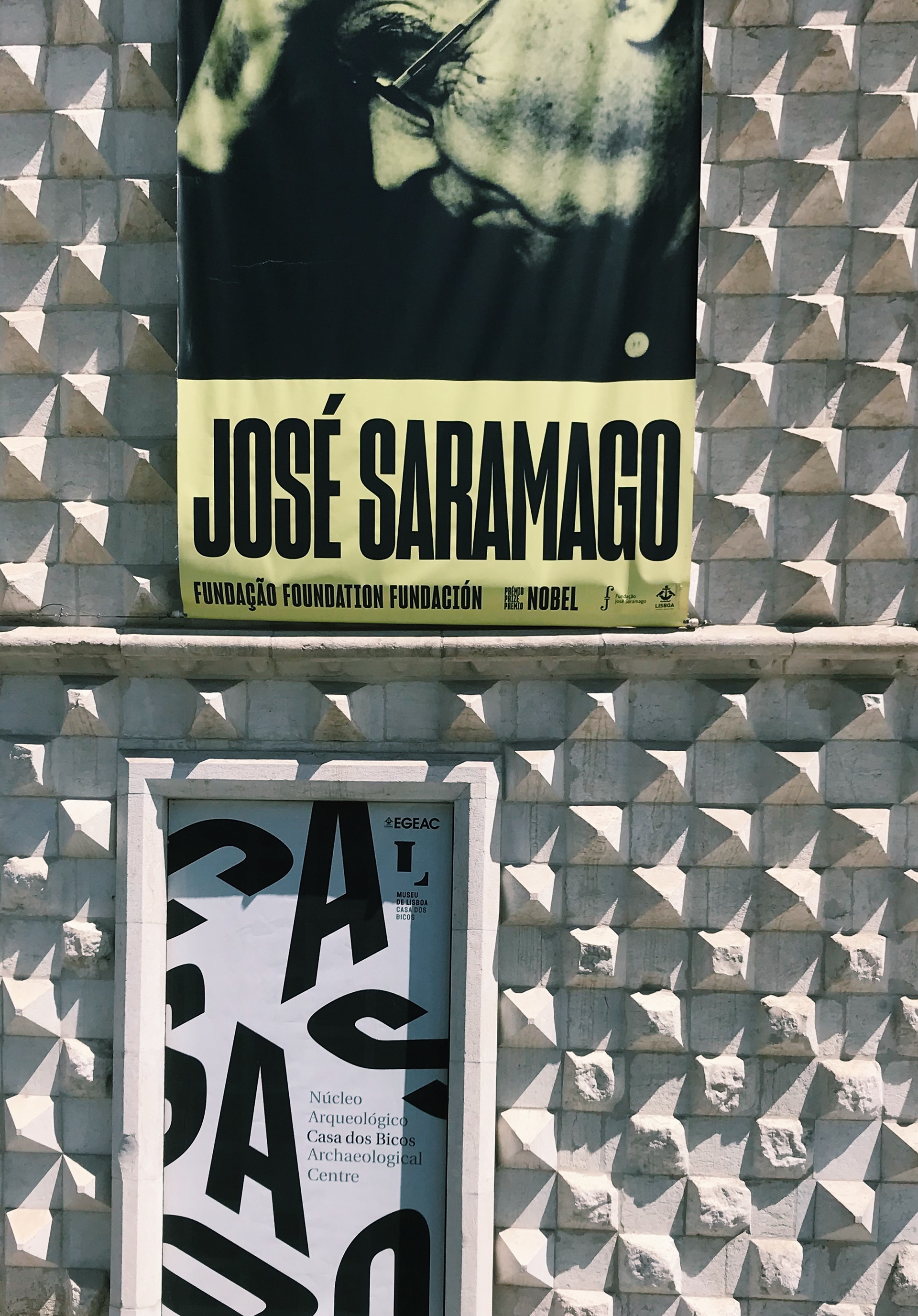
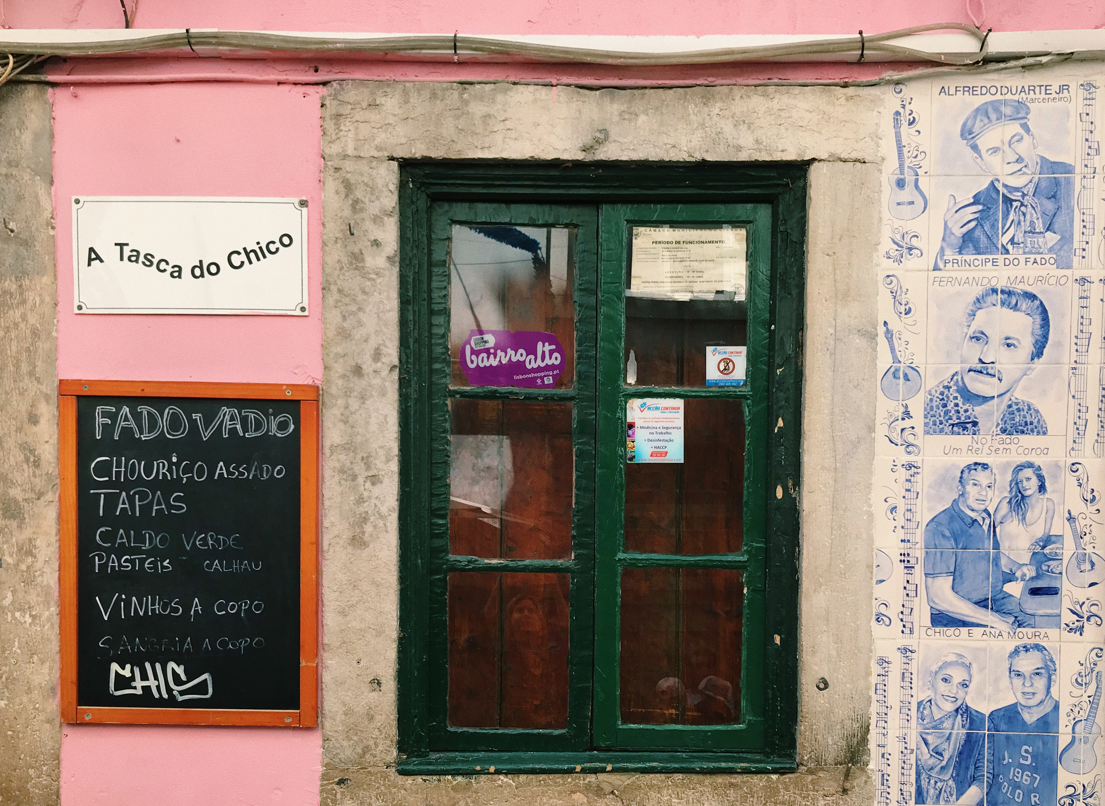
This vintage sardine packaging design, found in the heart of Lisbon’s oldest and most authentic neighborhood, Alfama, is a timeless and genuine reflection of Alfama itself. The retro illustration, typography and vivid color palette embodies the artistic and colorful district, taking you back in time to evoke nostalgic and neighborly emotions. This package design teleports you to the old town of Lisbon, where you can feel the district’s soulful and untouched maze of cobblestone streets amongst the most vibrant of homes that make Alfama so unique and touching to its visitor's hearts.
Lisbon, Portugal
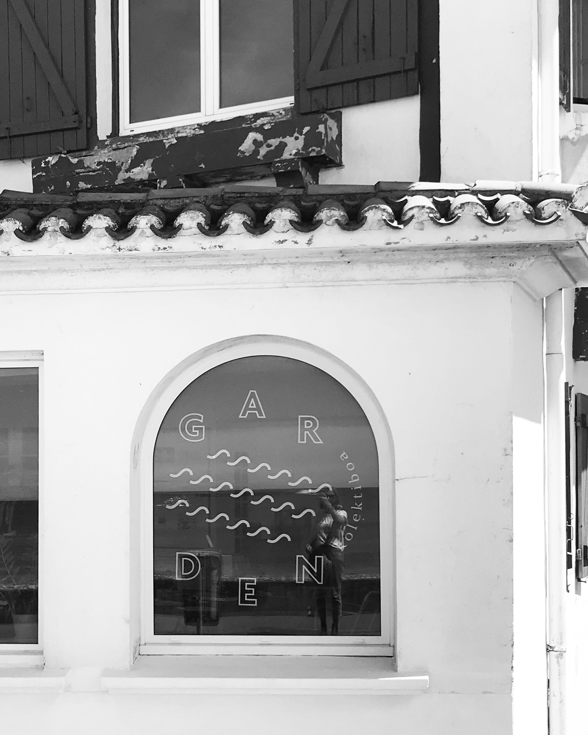
I stumbled upon this contemporary window art that is the essence of the quaint south of France surf town, and I couldn’t help but capture it on camera. The modern design juxtaposed amongst the charming Basque architecture is uniquely refreshing. The simplistic wave shapes define less being more. I’m keen to the curvature of both the waves and the typography in relationship with the curve of the window and the balance and movement that it creates, which ultimately ties this creative piece together.
Sain-Jean-De-Luz, France

This distinctive, type-driven newspaper caught my attention for multiple reasons. The huge, high-contrast and well-balanced headline typeface is truly refreshing and full of confidence in the days of a dying print industry. The symmetrical application of the typography on the front page is executed in a tasteful manner. The cropping of the headline typography is just begging for you to open the entirety of the piece. If only I spoke Czech!
Prague, Czech Republic
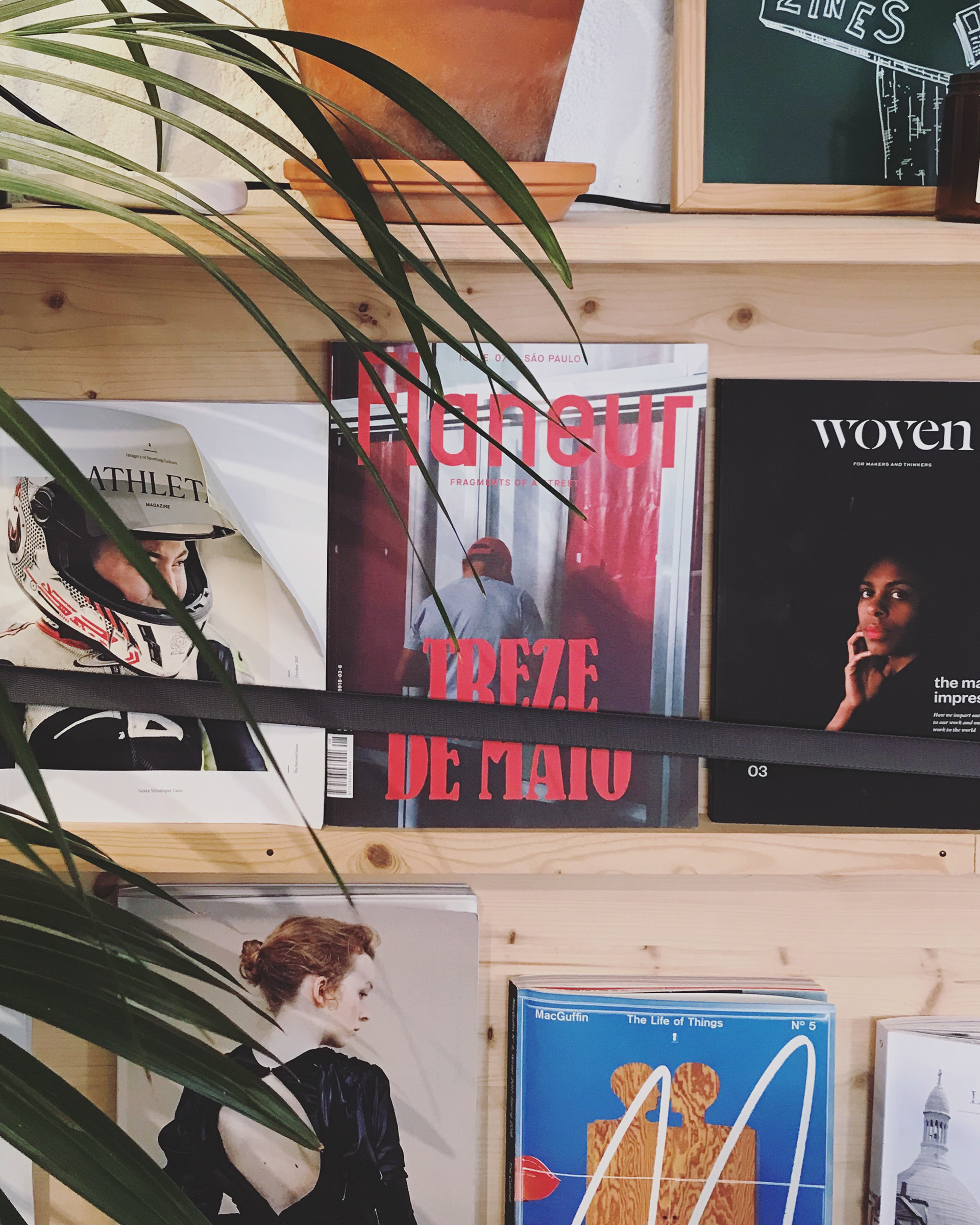

I was astonished by Lisbon’s vast appreciation of independent magazines, showcasing publishers from all parts of the world. If you couldn’t already tell, I’m a sucker for inspiration, so becoming lost in design at a coffee shop with many beautiful magazines was a dream come true. There’s something so impactful about immersing yourself in tactile magazines. Maybe its the texture and paper weight in your hands, or the lack of paper copies these days due to the digital revolution that makes it so sacred to me.
Lisbon, Portugal

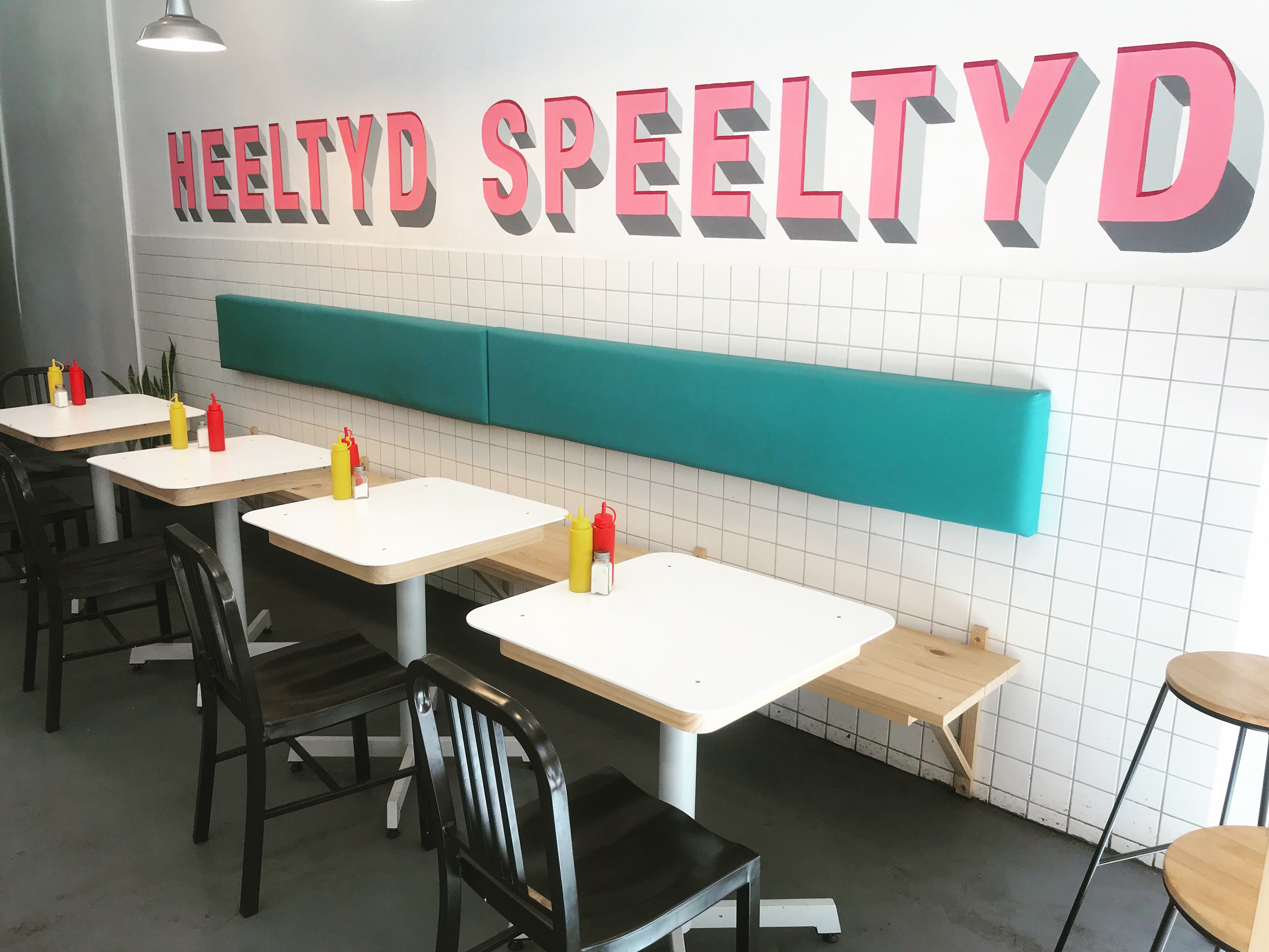
First off, Cape Town blew me away in all aspects, but especially in the creative department. I did not anticipate to see so many progressively leading and brilliantly crafted brands. This branding system at a health food cafe was one of my favorites because it communicates in an inviting yet minimal way to curate the story of the brand with its graphics. The clean icons and black and white color scheme are timeless, compelling and wholesome. This place was always packed and I’d have to imagine that it had something to do with its impactful branding.
Cape Town, South Africa